
Amazon revamps Fire TV user interface with new home screen, improved navigation and more – TechCrunch
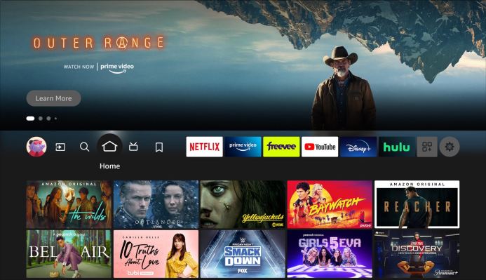
Amazon Fire TV revealed an updated user interface that aims to improve the navigation experience for users. Instead of a text menu item, there will now be an icon-based navigation bar that offers quick access to popular destinations, including “Home,” “Find,” “Live,” and “My Stuff” with icons like a magnifying glass, bookmark, house, and so forth.
The changes are meant to address some of users’ complaints about last year’s Fire TV makeover, by refining several features, bringing back missing sections, and simplifying navigation.
As part of the revamp, amazon renamed “Library” to “My Stuff” — a term also used by Hulu — yet this tab still contains the same watch lists, video libraries, recently launched apps, as well as rented or purchased content. This slight change will most likely cause the most excitement among Fire TV users, as the “Library” tab was removed from the navigation menu last year.
The “Find” section didn’t just undergo a cosmetic change, however. Amazon integrated “Search” and “Find” to create a single destination for users. The search bar functions the same as before, taking users to the same search screen. But instead of the many categories provided by the “Find” tab, it has been trimmed down to two rows. The top row consists of categories like Free, Movies, TV Shows, Apps, and Kids and Family, followed by a second row below that of recommended categories. Previously, there were four rows.
The “Find” tab can be seen on the main navigation panel as a magnifying glass icon. It has been moved to the left of the “Home” icon. The only change that occurred with the “Home” and “Live” tabs are the icons replacing the old text.
“Last year, we completed a major overhaul of the Fire TV experience, and since then, we have continued to make refinements to make Fire TV the most engaging and personalized streaming experience,” Joshua Danovitz, Director, Fire TV Experience, said in a statement. “The recent updates bring Search and My Stuff to the top of our Home page so customers can quickly find content and access their watchlists, rentals, and purchases.”
The new navigation menu was tested back in April and will slowly roll out to Fire TV devices.
Text buttons have been part of the Fire TV interface since the beginning, so it will be weird to see them gone. The previous navigation menu (see picture below) consisted of the user profile icon and three text buttons for the “Home,” “Find,” and “Live” tabs.
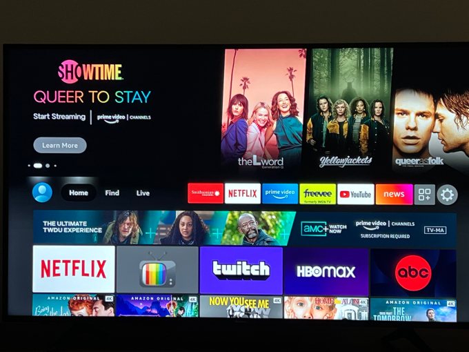
Image Credits: TechCrunch
The refreshed home screen is the latest update to Fire TV’s interface designed to simplify navigation. In March, Amazon introduced an easier way to manage live TV services on the Universal Channel Guide and the tech giant is continually incorporating Alexa into voice remotes.


Pingback: ข่าวบอล