
M&M’s makeover: Candy maker revamps mascots with less sexist look | Business and Economy News
Candy maker Mars said it wants to give its mascots more nuanced personalities as a way to promote inclusivity.
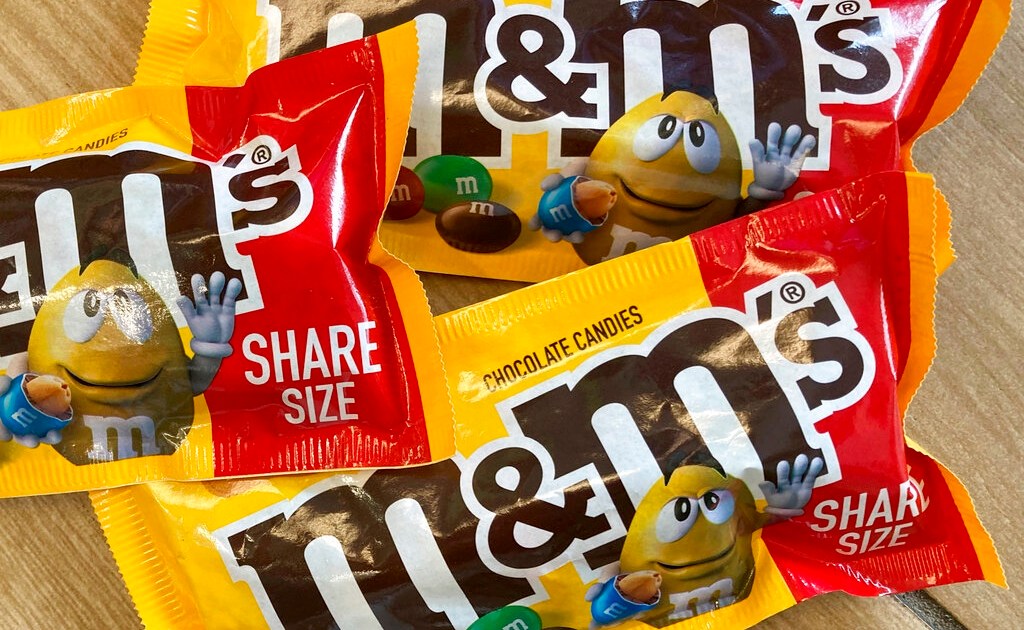
Candy maker Mars is giving a makeover to its six M&M’s characters as a way to promote inclusivity.
The company said that it will provide a modern take on the appearances of the characters — which Mars calls “lentils” — and give them more nuanced personalities. The lentils, which are featured in red, green, orange, yellow, brown and blue, will also come in different shapes and sizes.
Some of the changes to the M&M’s characters include making two of them less stereotypically feminine. In the new version, the green M&M ditches high-heeled boots in favour of sneakers and the brown candy no longer wears stilettos, opting instead for lower heels.
“Our ambition is to upend the expected, breakthrough barriers, and discover the little joys shared in everyday life. Imagine a world with less judgment & more connection & consistent laughter,” the United States-based company said on its website.
Mars, whose brands also include Twix and Snickers, said that it will put added emphasis on the ampersand in the M&M’s logo to demonstrate how the brand aims to bring people together.
The move towards inclusivity and embracing individual differences comes at a time when consumers are growing increasingly aware of how products are marketed to them. Mars is aware of this, having had to change the name of its Uncle Ben’s rice brand in 2020 due to criticism. Quaker Oats Company’s Aunt Jemima brand pancake mix and syrup — part of PepsiCo — rebranded last year because it said that Aunt Jemima was based on a racial stereotype.
But some marketers believe that Mars may be overthinking the marketing of its M&M’s.
Allen Adamson, co-founder of marketing consultancy Metaforce, says the move to overhaul the character of the M&M’s is a “good idea”, but it’s just an example of how worried marketers are about offending consumers. And he believes this step is on the “verge of potential overthink”.
Marketing consultant Laura Ries agrees, though she praises Mars’s emphasis on the ampersand as a symbol of unity.
“They’re looking for some attention and trying to jump on the bandwagon of trying to be more inclusive,” Ries said. “I don’t think there was an overall outcry of the overall sexualisation of the M&M. It’s just an M&M.”


Pingback: สล็อตเว็บตรง